
Red + Purple Is Everywhere This Fall. But Is It Your Color Combination?
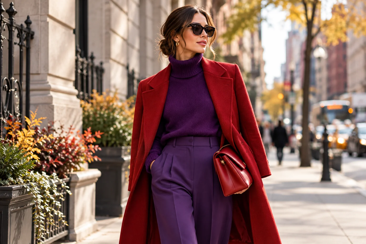
Red and purple are having a moment.
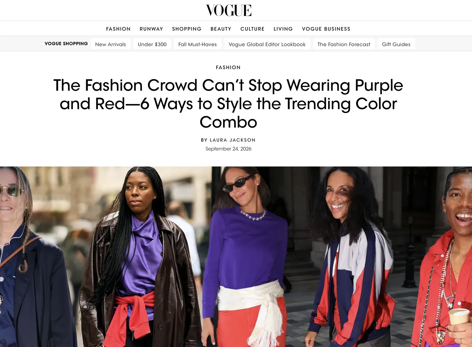
The red and purple color trend is one of the standout fashion stories of Fall 2026. From runway collections to the sidewalks of Manhattan, red and purple are emerging as one of the season’s most noticeable color pairings.
What might once have felt like an unexpected clash is now appearing outside fashion shows, in retail windows, and across New York street style. It is energetic, expressive, and a clear departure from the city’s familiar autumn palette of black, camel, and slate gray.
But when a color combination starts appearing everywhere, there is another question worth asking:
There Is No Single “Red”
A color name tells us surprisingly little.
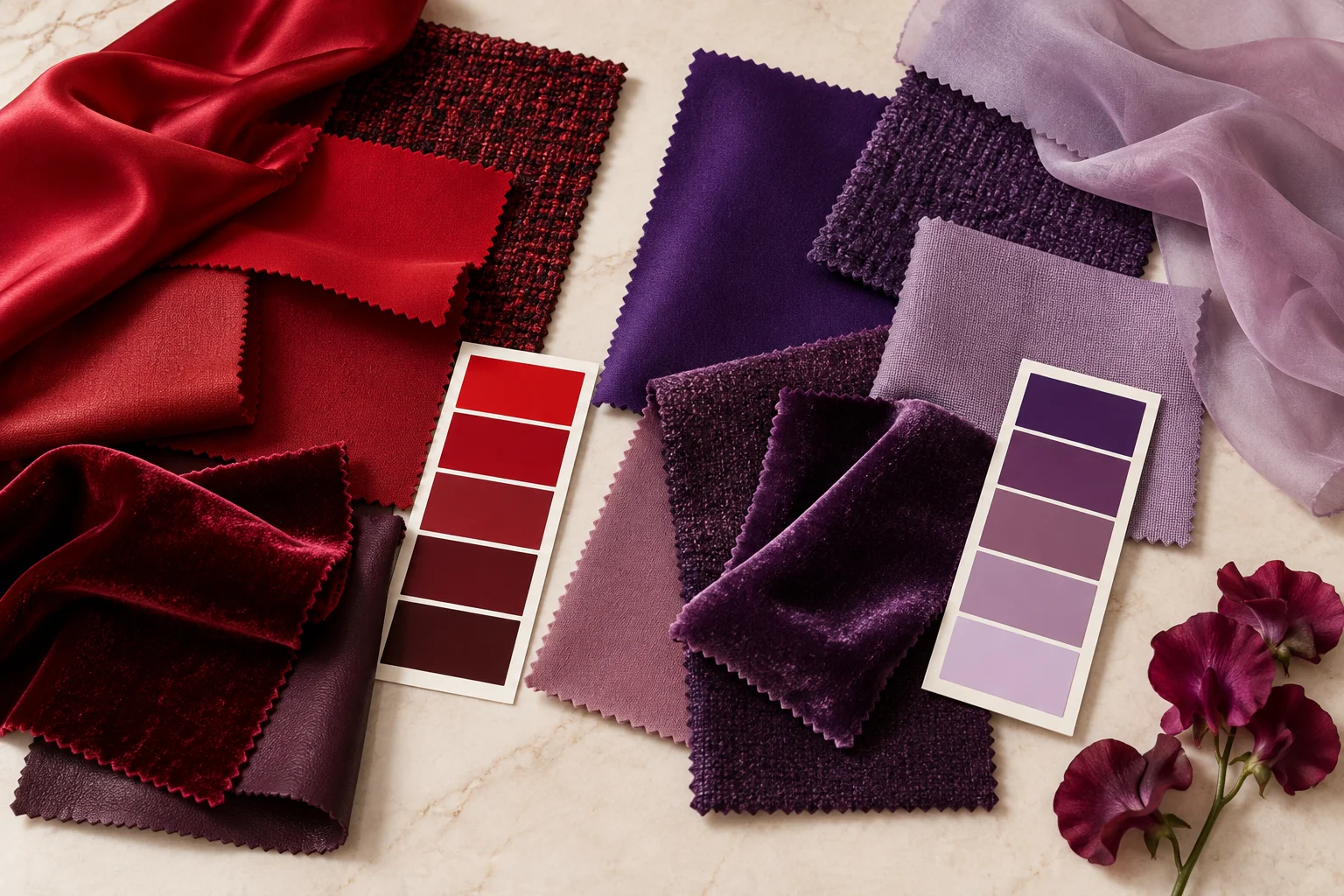
Cherry red, tomato red, cranberry, brick, scarlet, burgundy, and wine can all be called “red,” yet they interact with a complexion in very different ways.
Some reds feel warm and vivid. Others are cooler, deeper, softer, or more muted.
Purple works the same way.
Royal purple, plum, aubergine, lavender, orchid, and dusty mauve may belong to the same color family, but they can create completely different impressions next to the face.
A saturated violet requires a very different balance of contrast and chroma than a deep aubergine or a soft lavender.
The Same Trend Can Look Completely Different
Because every color exists across a spectrum, the same trend can be interpreted in very different ways depending on the individual.
- Bright Cherry Red + Royal Purple: High saturation and strong contrast. A bold combination that works best when the wearer can support clear, vivid color without being overwhelmed by it.
- Cranberry + Deep Plum: Cooler and more grounded, with richer depth and a slightly softer effect than bright red and royal purple.
- Burgundy + Muted Violet: Lower in chroma and more understated. This pairing creates a quieter, more refined version of the trend.
- Soft Brick Red + Warm Orchid or Lavender: Lighter and gentler, with a softer relationship between the two colors.
What changes between these combinations is not only personal taste.
It is the interaction of temperature, lightness, chroma, and contrast.
Warm vs. Cool Is Only the Beginning
When people first encounter personal color analysis, the conversation often begins with a simple question:
Are you warm, or are you cool?
Undertone matters, but it is only one part of how color interacts with the face.
At COCORY, our analysis considers multiple color characteristics, including undertone, lightness, redness, yellowness, chroma, and facial contrast.
Using proprietary measurement tools such as the COCORY CUBE and TONEPICKER, we combine visual comparison with measurable skin data to look beyond guesswork.
That is why someone may struggle with a bright tomato red but look balanced in cranberry, oxblood, or a softer burgundy.
For clients looking for personal color analysis in New York, understanding these differences can make seasonal fashion trends much easier to interpret.
Personal color analysis is not about telling someone that a trend is “allowed” or “not allowed.”
How to Wear the Trend Without Rebuilding Your Wardrobe
Trying a bold color combination does not require dressing head-to-toe in red and purple.
In New York, where practicality and versatility shape most wardrobes, the trend can be introduced in smaller, more intentional ways:
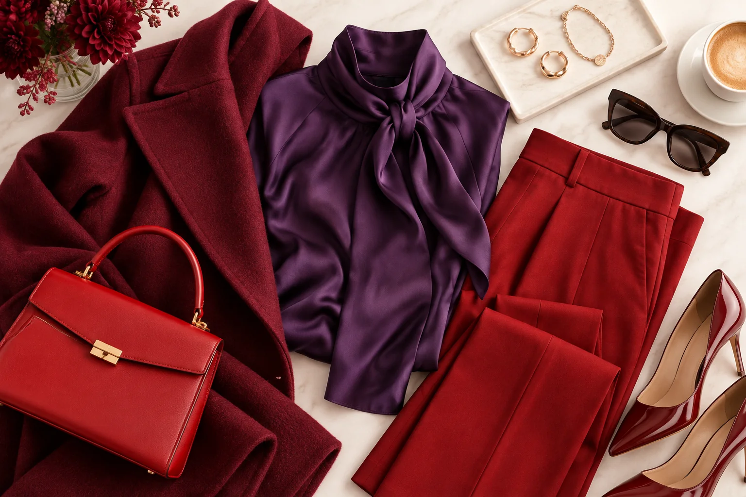
- The Focused Accent: Pair a purple knit with a tailored neutral coat, then add a structured red handbag.
- Tonal Layering: Layer a burgundy wool coat over a muted violet or orchid blouse for a softer, more editorial effect.
- Tailored Anchor: Style deep red trousers with a plum blouse and neutral footwear for a polished, city-ready look.
- Neutral Bridge: Start with charcoal, cream, espresso, or navy, then introduce red and purple through a scarf, bag, jewelry, or another smaller accent.
Trends Change. Your Color Data Does Not Have To.
Next season, another color combination will take over.
That is the nature of fashion.
Personal color analysis is useful because it gives you a framework for interpreting trends rather than simply copying them.
When you understand your own relationship with color, trends become easier to adapt. You can choose the version that feels current while still working with your complexion, wardrobe, and personal style.
So instead of asking, “Can I wear red and purple?”
A better question may be: “Which red and which purple are mine?”
Discover Your Personalized Palette
A private color analysis experience combining draping, measured skin data, and COCORY’s color system.